

Viewing your data
Inspect, filter, annotate, and visualize an experiment's processed tables.
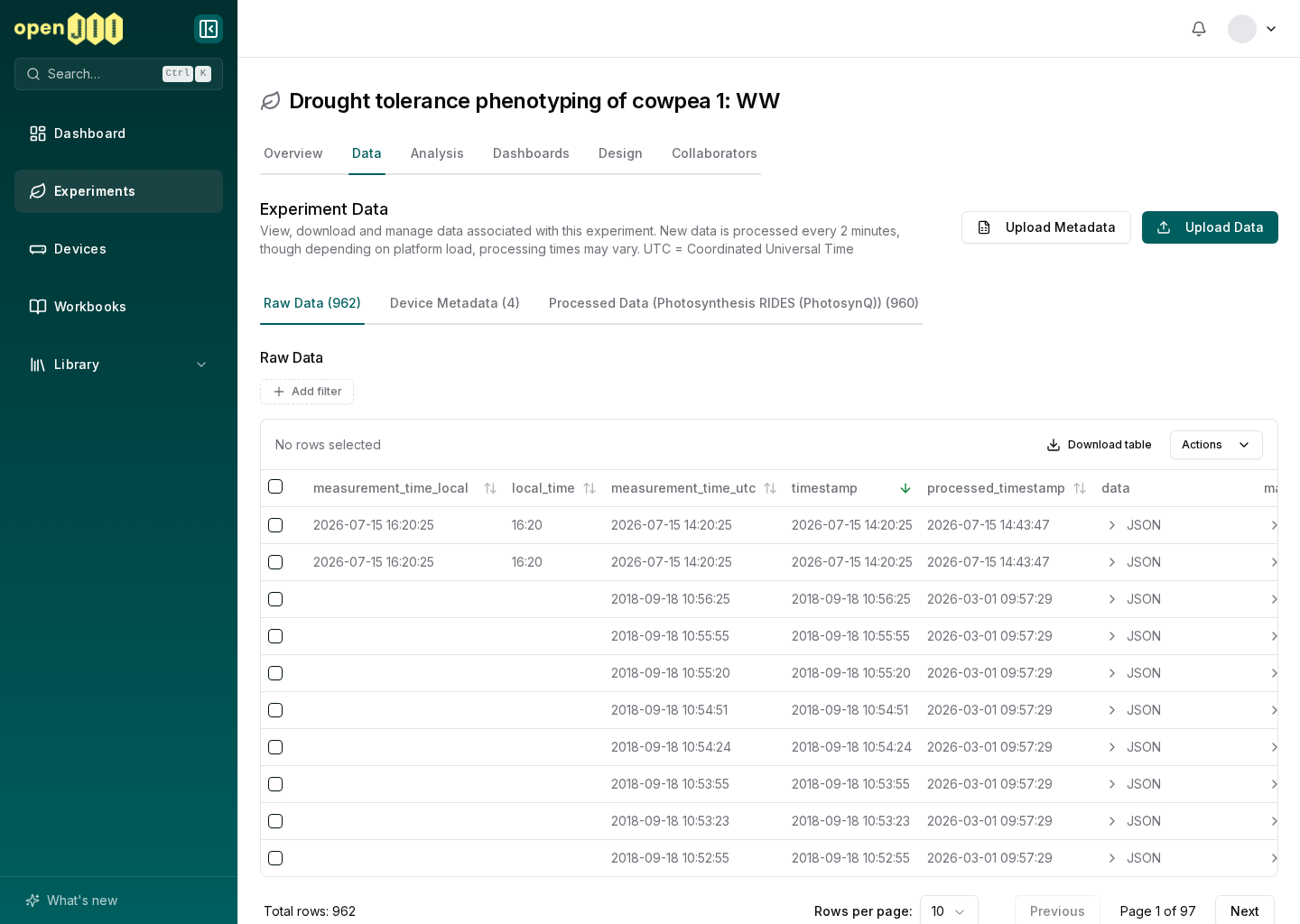
Open an experiment and select Data. The dataset picker above the table names the dataset you are looking at and its row count. Opening it lists every dataset in the experiment, grouped by where it came from: the source tables, anything a macro produced, and anything uploaded.
Inspect a table
- Open the dataset picker to change tables. Type to filter it when an experiment holds many datasets.
- Select a column heading to sort ascending or descending. When the experiment anonymizes contributors, the contributor column sorts by the pseudonym it shows.
- Use filter chips to narrow rows by one or more columns.
- Change the rows per page or move through pages.
- Expand structured values when a cell cannot be read comfortably inline.
- Select rows to add or remove comments and quality annotations.
Numeric columns can open a quick table chart. This is useful for checking a distribution while cleaning data; it is not a saved analysis.
A table with more than 200,000 rows opens on its latest 30 days: the filter bar
shows a timestamp filter starting 30 days before the newest measurement. It is
an ordinary filter, so change the date or remove it to see older rows.
A field from a macro, a question, custom metadata or an uploaded file can have
the same name as a column the table already has, such as device or id.
Capitals do not matter here, so Device clashes with device. The table keeps
both, and both headings show the same name. The table's own column has no tag;
the field carries a small tag saying where it came from: Macro output,
Question, Metadata or Uploaded. Hover the tag to read why it is
shown separately. For a macro output or a question, the tooltip also gives the
name the field has in exported files, such as device_output. Filters and chart
pickers show the same tag.
New rows arrive on their own
You do not need to reload the page to see new measurements. While the browser tab is visible, the Data page checks for new rows every 30 seconds and refreshes the table when the dataset in front of you changes. After ten minutes without mouse, keyboard or scroll input it stops checking and the line says Paused; the next input catches up at once. A row that arrives this way is tinted for a moment so you can spot it. Your sort, filters, page and selected rows stay where they were.
The line under the page description says Live and when the newest data in the dataset was received. For a macro dataset, that is when the measurement the result came from was received, not when the macro ran. Select the pause button beside it to hold the table still while you work through it, and select it again to catch up. If the page cannot reach the platform for two minutes, the line says when it last refreshed instead. Dashboards and the visualization editor show the same line, for the datasets their charts and tables use.
Build a saved visualization
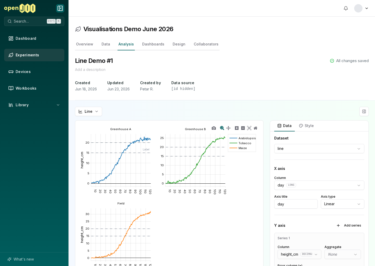
Open the experiment's Analysis area and choose Visualizations. Anyone with Can edit can create a visualization, select a data table and columns, choose a chart type, and configure its style. Saved visualizations can also be placed on experiment dashboards.
The current interface supports many chart families, but a chart is only as sound as its data configuration. Check units, missing values, grouping, contributor anonymization, and the protocol version before interpreting a pattern.
Line and area charts draw a long series at screen resolution, keeping the lowest and highest value for every pixel column, so a peak or a gap never disappears from view. When the table holds more than 4,000 rows and the chart plots line or area series over a time or numeric x axis, the platform reads the table this way instead of reading its rows. Zooming in reads the visible range in more detail, down to single rows once it holds 4,000 rows or fewer. That applies only when the chart has no aggregation, stacking or size column, every series is drawn as a line or area, facets share their x axis, and the column names start with a letter or underscore and use only ASCII letters, digits and underscores.
A line under the chart says Drawn at screen resolution from 553,000 rows., for example. Show every point reads and draws the rows themselves instead, up to the 100,000-row limit below, and Draw at screen resolution switches back. The choice is not saved with the chart. A line styled with markers draws them only while the chart's lines hold at most 2,000 points in view between them, so a long series shows as a clean line. The markers return as you zoom in, or everywhere with Show every point.
Any other chart reads at most 100,000 rows, and tables with very wide rows can stop it sooner. When the data holds more, a line under the chart says how much it shows, for example Showing 100,000 of 553,000 rows. Add a filter to see all matching rows. Add a filter to the visualization or to the dashboard until every matching row fits, or export the table to work with all of it.
Colour a scatter chart by a column
On a scatter chart, the Group by shelf colours the points by a column. When you pick the Column, Mode is set from its type: a text or yes/no column, or one naming a contributor or device, becomes Categorical (per value), and a numeric or date column Continuous (gradient). You can change the mode afterwards, except that a categorical column cannot use a gradient; the option says Continuous gradient needs a numeric or temporal column.
- Categorical (per value) gives every value its own colour and its own legend entry, with an empty value listed as "(none)". Category colors sets the colour for each of the first 50 values; the rest take their colours from the palette.
- Continuous (gradient) colours each point along a gradient, with a colour bar you can hide with Show colorbar.
Filter a dashboard
A filter widget narrows every chart and table on the dashboard that reads the same data table. A between filter needs both From and To, with From as the start of the range and To as the end. When a filter's value can't be used, the widget says what to fix under its fields: Add a To value, or clear From., Add a From value, or clear To., Swap From and To, or change one of them. or This value can't be used as a filter. A between filter on numbers or dates also outlines both fields in red. The filter doesn't filter anything until then. Each chart and table on that data table says so in a line under it, for example 1 filter skipped: Signal, naming the filter by its title, or by its column when it has none, and shows its rows without that filter. The dashboard editor shows the same reason for a filter's default value. Clear both fields to remove the filter on purpose.
Cross-experiment comparison and easy bulk exploration of raw fluorescence traces are known research needs, but they are not established as first-class workflows on this branch. Do not describe the in-app view as replacing a complete statistical analysis.
For R, Python, or another statistics tool, continue with Exporting data.